The Bulloo Shire logo was developed after extensive community consultation involving surveys, workshops and personal conversations. We needed to uderstand how shire residents felt about their Shire, but also how they wanted to be percieved by visitors. The general consensus was that people thought the outback was just dust and flies; so the logo was […]
Category Archives: Branding
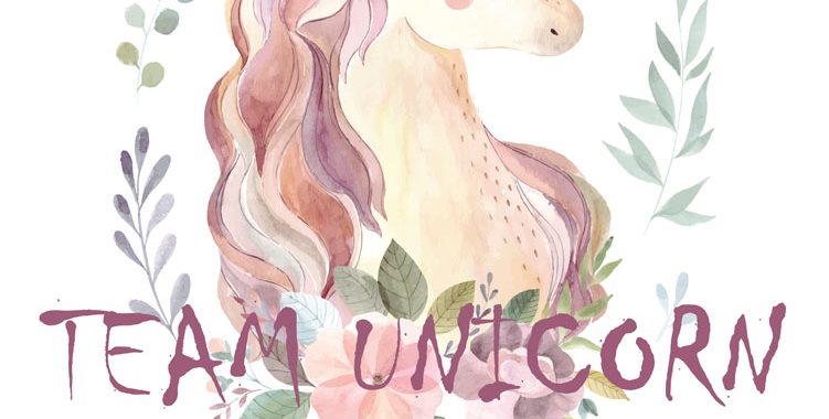
Team Unicorn
The Team Unicorn logo and tagline has been developed as a fun brand aimed and middle aged women; specifically dressage riders who spend their time searching for what they call a unicorn… a magical beast that ticks all of the boxes; has a bit of class, is safe to ride and a nice person to […]

Live Outback
The Live Outback brand and logo has been desiged as the flagship for a project to promote migration to the Bulloo and Paroo Shires. The design intends to promote the ideas of lending a hand and helping each other in a friendly and welcoming way. The final design also pays respect to the large indigenous presence in […]
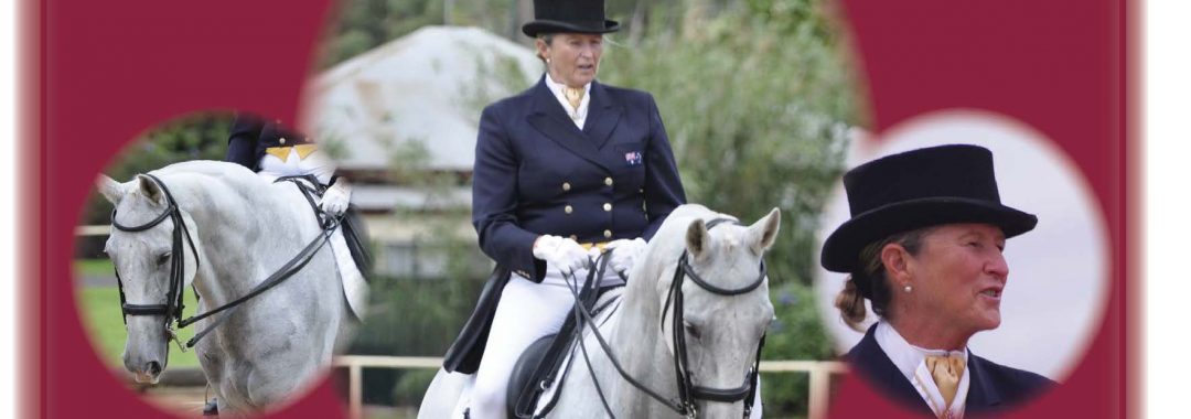
Vision is much more than seeing…
The Tag Line, “Vision is much more than seeing…” was developed for blind Paralympian Sue-Ellen Lovett and has been used on brochures, websites and most recently on the covers of her two recent books, Johnno and the Blind Chick. The line came from the idea the that your life is about your dreams for the […]